My wordies — how time has flown! If it’s March 4, it’s National Grammar Day once again, and here’s MRP with some goodies. Just. For. You.
First, h/t to one of my roving reporters for this little tidbit, spotted in Minneapolis. Oh dear, will no one think of the childrens and add an apostrophe to Children’s Center? Please?

Next, you could do no better than to head over to the official National Grammar Day site (put together by the one and only Grammar Girl) for t-shirts, contests, free wallpaper, and other Grammar Day swag. While you’re there, you’ll want to check out this year’s installment of John E. McIntyre‘s Grammarnoir serial: “Grammar Never Takes a Holiday” (and read Grammarnoirs of years past) and get the results of Editor Mark‘s grammar haiku contest. And for real-live Grammar Day fun, check out #grammarday on Twitter.
And there’s more. More! Because you’ve been so good this year, here’s the late, great Pete Seeger with his rendition of “English is Crazy” (more like English is curaaaaayzee!). You know that’s true.
And if you’ve never seen this piece by poet Taylor Mali, then you’ll want to check out “The The Impotence of Proofreading,” like, now. H/t to David for that.
And finally, wordies, please remember what MRP has always told you on this most special of word nerd days: You have been given a great power and with it comes great responsibility. Have mercy — do not use your ability to write grammatically correct, well-punctuated, and perfectly spelled sentences to put down and insult those who struggle mightily. Go forth and be kind to others who have made mistakes. Peeve no more — next time, the red pen may be pointed at you. Happy National Grammar Day!


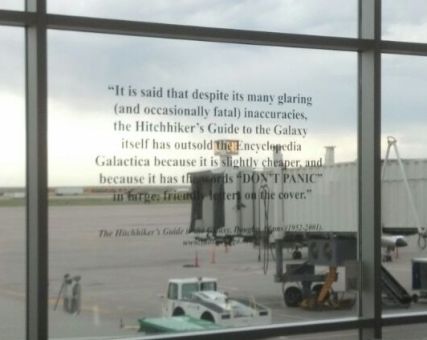 So today, wordies, would have been the 62nd birthday of preeminent word nerd Douglas Adams. How many of us grew up reading all five of the books in the Hitchhiker’s Guide to the Galaxy trilogy? Did you make jokes about the number 42? And did you randomly say “So long and thanks for all the fish”? And do you now love to quote Adams’ sage words: “I love deadlines. I like the whooshing sound they make as they fly by.” Sure, me, too.
